Project 2 Reading Pictures: Decoding advertising

Exercise: Select an advertising image and write on as many parts of the image as you can. Comment on what it is, what it says about the product, and why you think it’s there. Come back to this exercise when you’ve finished Part Four and see if you can add anything to your analysis.

I got quite absorbed in this exercise and ended up using several examples rather than just one. I deliberately chose a varied set including a few that could be regarded as iconic. I also included a couple that might be thought of as breaking with the norm in terms of advertising including the Dove Real Beauty campaign and Radiance (L’Oreal) with Helen Mirren.

I looked at each in turn and started with an intuitive response, then considered their composition and structure looking at lighting in particular. I also tried to identify the signifiers and signified. The variety in the product placement was interesting, in two cases (Obsession & Radiance) there was no obvious product image included at all. Having done the short course with Karl Taylor in January the No5 ad reminded me that he said he always uses graduated lighting on his products shoots to signify luxury. The ads use a variety of gazes in terms of the models involved, they all include people, and they use a range of backgrounds from solid black to outdoor. Based on my interpretations the ads signified different things depending on the brand (not all I imagine are what the advertisers would want):

  • Dove – all women are beautiful (I have mixed views about the campaign bearing in mind it is still a commercial product)
  • No5 – success, achievement, glamour, aspirational
  • Obsession – danger, intrusive, vulnerability (I still find this ad quite disturbing even more so having read some of its backstory and realising Kate Moss was 17 at the time)
  • Calvin Klein – health and well-being, strength and flexibility, an aspirational body
  • Levis Roadwear – freedom, free spirit, following your dreams
  • Rolex – achievement, success, breaking boundaries and exploration, life changing achievements (There is an odd dissonance in that I had read the figure as Amilia Earhart but the factoid is about the sound barrier being broken in 1947)
  • Radiance – strong, empowered, visibility, self-esteem, growing old with dignity and flair

In looking back at my initial thoughts I think I was reasonably comfortable with reading the advertisements but what I did not have at that point was the language to fully express the relationships between referent systems.

Reading Williamson (1978) and Hall  (2012) highlighted different elements I was able to then apply. The aspect I found most useful from Hall was that of the linking notion or the ‘abstract concepts’ (Hall, 2012: 54) that connect signifier and signified and that this can be thought of in metaphorical terms. For example, the No5 ad with Nicole Kidman where she is placed in metaphorical relationship with the perfume associating it with beauty, glamour and success, Hall describes it in terms of a form of transference.

Having a deeper framework for analysis provided by the reading and the exercises in this section has added to the depth of my understanding. What I found particularly interesting was making comparisons across the set of advertisements to see the different techniques that have been adopted. It seems to me their core referent systems are based around the fact that however sophisticated these signs are they are ultimately designed to sell products and make money for those paying the ad agencies. This in turn ties their reading into wider economic, cultural and social systems.

The decoder of advertisements is no longer a passive colluding reader but a critical reader, revealing and effectively denying the efficacy of the process of meaning transference.(Harvey, 2011)

References and citations

Hall, S. (2012). This Means This This Means That: A user’s guide to semiotics. London: Laurence King Publishing.

Harvey, L. (2011). Class: Judith Williamson – Decoding Advertisements  Retrieved 28th February, 2016, from http://www.qualityresearchinternational.com/csr/classwilliamson.php

Williamson, J. (1978). Decoding Advertisements: Ideology and meaning in advertising. London: Calder and Boyers.


In Search of Semiotics

So, I understand that semiotics is defined as ‘everything that can be taken as a sign’ (Eco, 1976: 7) and I understand it has what sometimes appears to be a complex set of characteristics. But frankly, I am confused about what it actually is. Is it a discipline, is it an epistemology, is it a methodology, is it a collection of methods, is it a philosophy or is it some sort of cultural studies cult?

I accept this may be as a result of my own ignorance, I may not have read the right books or papers, it is certainly possible I have not read enough of them but trying to fathom this out is not proving easy. It seems to sit within a social constructionist and interpretative paradigm but while some authors surface this others do not. I think this is partly why I felt such frustration in reading Jobey’s account of ‘Young Brooklyn Family.’

I have been trying to find critiques of semiotics and a few have surfaced but they seem to be far from the norm. Given my personality type (as explored in assignment three) it is perhaps little surprise that I was becoming increasingly sceptical about the apparent lack of a counter-narrative to semiotics, or at least some debate of its shortcomings. Although some semiotic analysts do refer to interpretation and some also acknowledge wider contextual factors not all do as I found with Jobey. It is hard sometimes to distinguish interpretations from those presented as fact.

As someone who has been involved with ethnographic research I am familiar with positivistic arguments being made against interpretative methodologies as well as having to be clear about the criteria against which the research can be judged. I have seen very little of this in the texts I have read so far around semiotics. That is not to suggest they are not there, it may just be that I have not encountered them to date.

I was pleased to find one paper that does offer a critique in a way that is coherent, comprehensible and resonated with my experience. Chandler (2002) offers various criticisms, in summary:

  1. The boundaries of semiotics seem to be ever expanding and have become so fluid it can now encompass almost every academic discipline – what Chandler refers to as the ‘imperialism’ of semiotics
  2. Semioticians are not always explicit about the limitations of their techniques
  3. There is an absence of transparency in the analysis of signs, implying they are objective realities rather than subjective interpretations
  4. Some analyses appear to have a preoccupation with classification which has a tendency to ‘downplay the affective domain’ and in doing so moves away from the subjective creating the illusion of objectivity
  5. Structural semiotics is only concerned with textual structure and in doing so negates the wider cultural context in which the text sits. In not taking account of the cultural context the impact of power structures, hierarchies and wider social constructs are ignored. As Chandler (2002) notes ‘the relationships between signifiers and their signified may be ontologically arbitrary but they are not socially arbitrary.’
  6. There is a concern that much of semiotics has become associated with a simple process of ‘decoding’. For me this has an ontological implication in that it suggests there is a single reality or truth to be uncovered if you know how to read the signs correctly

Semioticians have recognised some of these shortcomings and Chandler (2002) goes on to describe the ‘turn’ to the social and post-structuralism, which has an equal concern with both structure and process.

I am pleased I took time to think about this further and it has helped reassure me that it is not necessarily something I am missing, this is in fact a complex and contested field. In terms of responding to my initial question of ‘what is semiotics’ it may be easier to think about what it is not and here I am inclined to agree with Chandler (2002) when he states:

Semiotics is not, never has been, and seems unlikely ever to be, an academic discipline in its own right. It is now widely regarded primarily as one mode of analysis amongst others rather than a ‘science’ of cultural forms.

References and citations:

CHANDLER, D. 2002. Semiotics for Beginners. Criticisms of Semiotic Analysis [Online]. Available from: http://visual-memory.co.uk/daniel/Documents/S4B/ [Accessed 16th May 2016].

ECO, U. 1976. A Theory of Semiotics, Bloomington, IN, Indiana University Press/London: Macmillan.


Assignment Four Reflections

Title: A picture is worth a thousand words

Having looked at a number of submissions for assignment four by other OCA students I have adopted slightly amended self-assessment criteria that provide more scope for reflecting on my essay.

Demonstration of subject based knowledge and understanding

This assignment has helped develop my subject knowledge around visual analysis and really exploring some of the basics of semiotics in particular. My understanding of semiotics has increased although with that has come a questioning of some of its underlying assumptions (see my entry In Search of Semiotics). In completing this essay I also acquired insights into the work of a single photographer and gained an experiential understanding of how I might apply the process I used to my own work and other photographers going forward.

My initial concern that the image might not have been regarded as having enough content has long since been dispelled. I still regard it as a powerful image that offers a depth of meaning (some of my fellow students have also had a similar response on seeing the photograph). Taking the work of an emerging photographer about whom there is not a large established body of knowledge also allowed me to develop my own responses without being unduly influenced by the reviews of others.

I think overall I have demonstrated a grasp of the review process and an understanding of the work of Dara Scully (although I know she would not write about her own work in this academic form).

Demonstration of research skills

I enjoyed the research activity for the essay, which took a number of forms:

  • Gaining more insight into Dara Scully’s photography, her background and her body of work
  • Other relevant photographers/photographs – either similar or different approaches to representing childhood and coming of age
  • Semiotics
  • Reading photographic images – other analysis approaches
  • Psychoanalysis and object relations
  • Theories around childhood and its meaning as a concept

This took longer than I had anticipated but its breadth provided a useful sensitising framework (Bruner, 1996) from which I could develop the depth of my own reading of The Cut. On initial reading of the image I thought I would be using concepts from psychoanalysis and objects relations such as the Mirror Stage (Lacan, 1949)   or Paranoid-Schizoid position (Klein, 1986) or possibly the plait as a transitional object  (Winnicott, 1951) but as my research progressed it was the interpretation of ‘childhood innocence’ that came to the fore.

The research took a process I am familiar with involving cycles of divergent and convergent thinking until my analysis was complete. It also followed a series of iterative stages: data collection, synthesising, analysis, and conclusions.

Demonstration of critical and evaluation skills

I think I have worked through a clear process of critical review and was open to the process taking me in a direction I might not have initially anticipated. I created a framework for the essay that was intended to highlight the interpretative nature of the exercise. The structure for the essay aimed to have a logical flow:

  • Personal reasons for selecting the image
  • Background to the photographer
  • Comparisons
  • Theoretical exploration of the childhood theme
  • Conclusions including a personal reflection

Feedback from other OCA students helped refine the structure and content, although I am not sure this intended structure was evident to all. It felt particularly important to draw out intertexuality as part of the evaluation by highlighting my personal responses to the image as well as considering where it might be placed within the wider field of representing childhood (both in visual and written texts). If I understand the concept correctly this has taken more of a social semiotic approach.

During the process I came across this quote from Chandler (2002):

Semiotic analysis often shows a tendency to downplay the affective domain – though the study of connotations ought to include the sensitive exploration of highly variable and subjective emotional nuances. (Chandler, 2002)

I found this to be an important distinction for me in evaluative terms as the affective domain (i.e. my emotional response) was the foundation for selecting the image in the first place and relates closely to this being an interpretative piece of research rather than an empirical natural science experiment.

Communication

Given the complexity of some of the concepts and the depth I could have gone into in relation to the photograph I did find the 1,000-word limit quite challenging. While I am satisfied with the result I know there was more I could have drawn out and explored. That said the word limit was a useful discipline in terms of tightening my language and trying to be clear about the structure. Sharing earlier drafts with some of my fellow students was a useful way of checking how some of the concepts were received by others, and inevitability there were elements I thought I was communicating well that were not clear to others. I am grateful to everyone who spent time to read the essay and comment.

My thanks to Steve Middlehurst for sharing his self-assessment criteria for the essay.

References & citations

BRUNER, E., M 1996. My Life in an Ashram. In: PATTON, M., Q. (ed.) Qualitative Research and Evaluation Methods. 3 ed. London: Sage Publications.

CHANDLER, D. 2002. Semiotics for Beginners. Criticisms of Semiotic Analysis [Online]. Available from: http://visual-memory.co.uk/daniel/Documents/S4B/ [Accessed 16th May 2016].

KLEIN, M. 1986. Notes on Some Schizoid Mechanisms. In: DU GAY, P., EVANS, J. & REDMAN, P. (eds.) Identity: A Reader. London: Sage Publications.

LACAN, J. 1949. The Mirror Stage. In: DU GAY, P., EVANS, J. & REDMAN, P. (eds.) Identity: A Reader. London: Sage Publications.

WINNICOTT, D. W. 1951. Transitional Objects and Transitional Phenomena. In: WINNICOTT, D. (ed.) Collected Papers: Through Paediatrics to Psychoanalysis. London: Tavistock.


Assignment Four: A picture is worth a thousand words

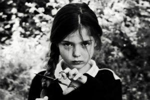
Assignment Four: Write an essay of 1,000 words on an image of your choice. The image I have selected is The Cut by Dara Scully, 2015

A young girl looks to camera, she is holding scissors across her plait

The Cut, Dara Scully, 2015

On the wall to the left of my computer is a black and white photograph; a young girl stares back at me uncompromisingly. Having considered several photographs (see my learning log) this was the image I kept returning to. There were occasions I looked at ‘The Cut’ and I imagined seeing my younger self looking back. The signification that emerged for me is that of belligerence. I could almost hear my mother’s voice – ‘don’t you dare, don’t you cut that plait!’ At which point I would hear the clip of the blades and the braid would be limp in my hand. My parents would have described me as a wilful child. I have interpreted the gesture as an act of asserting identity and autonomy. Given the polysemous (Barthes, 1977) nature of photography this personal response sets the context for my interpretation and analysis of the photograph.

Dara Scully (b.1989) is a photographer and writer based in Spain. She studied Fine Arts at Salamanca University and has a wonderfully lyrical way of describing her practice. She accepts she is obsessed with childhood, ‘maybe it’s because everything is so pure in childhood, so raw…cruelty, tenderness, evil, kindness… they feel all those feelings and show us just as they are.’(Ashley, 2015b)

She has exhibited in Spain and internationally, and was ‘Commended’ this year in the Sony World Photography Awards (People Category). While she is attracting growing acclaim for her work she has also been subject to some critique for her explorations of childhood (not unlike Sally Mann) and death. This posed a question for me around accepted portrayals of children and childhood.

A while back I featured an image of Dara Scully’s on the Instagram feed and immediately it drew a lot of attention; a few were disgusted by her work while others defended it…I embrace the fact that some of the images make the viewer a bit uncomfortable.(Ashley, 2015a)

At first glance the image may appear to denote a candid moment of a child playing. A neatly dressed young girl (perhaps in school uniform) looks to camera, behind her the background foliage is out of focus, the shallow depth of field making her all the more pronounced. Her hair is a little tussled and the parting is crooked but the plait looks neatly braided. You then notice her gaze and the claw like fingers on the scissors that are poised across the plait. Her right hand (almost out of shot) is holding the hair firmly. The black and white nature of the image and the clothes she is wearing give the photograph an ambiguous position in time, it could be contemporary or it could be historical. The Cut’s connotations for me echo myths and fairy tales; those dark tales of childhood, often in woods or forests, where good battles evil.

The studium appears to speak of childhood and possibly coming of age, whereas, the punctum is the scissors and the nature of her gaze. These signs are ‘that accident which pricks me.’ (Barthes, 1981: 27) This is not a passive, acquiescent, childlike look. It has a darkness to it. She looks defiant with wisdom beyond her years. Almost daring the photographer to take a step closer (or maybe even to take the photograph?) and if she does she will sever the plait. There is something threatening in her stance and her gaze.

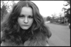
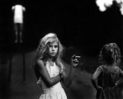
In exploring the intertextuality of ‘The Cut’ I am reminded of the iconic coming of age work of Szabo, particularly ‘Priscilla’, here the plait and scissors are replaced by the cigarette, but the defiance in the gaze is similar. There are also echoes in ‘Long Island Girl’ and Sally Mann’s ‘Candy Cigarette’.

Szabo’s images recognise the often hidden complexities of the journey into adulthood too.

The innocence of the students can really affect you…a number of [my] images express the inner life, the inner difficulties that teenagers have. (Philips, 2014)

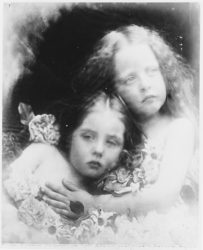
Perhaps, more interesting than the similarities are the contrasts to those images of a more romanticised ‘innocent’ childhood like those of Julia Margaret Cameron, and commercial advertising, which appear to have gained such a dominant place in the collective psyche.

Scully’s work feels brave, honest and revealing against this backdrop and in an era when there is so much concern about the representations of children. We endure news coverage of out of focus children and hear of schools banning parents photographing events. There is no doubt that safeguarding issues are important and I confess I was mindful of researching this issue. The Cut surfaces an important dialogue about our social concerns for the loss of innocence.  It is suggested this is a largely adultcentric concern with the meanings of ‘childhood’ being largely determined and defined by adults for adults.(Robinson, 2008)

Thus, the defining boundary between adults and children, and the ultimate signifier of the child—childhood innocence—is a constructed social and moral concept. (Robinson, 2008: 115)

In this photograph I see Scully playing with this boundary and deliberately disrupting our conceptions of innocence and evil, childhood and adulthood. She does not do this lightly and the children she works with are active participants in her work, she recognises the delicate ground she is treading, ‘childhood and death are kind of taboo.’ (Ashley, 2015b) There is a perceived crisis in the apparent loss of an innocent childhood but it could be argued that this is actually more of a crisis of adulthood in a rapidly changing world.(Holland, 2004) In The Cut the gaze is confrontational a possible challenge to an established but diminishing power order. It opens a discourse that explores a more contested view of representations of childhood. The Cut, for me personally, recalls those periods of confusion, some darker days, in the twilight period of childhood and adulthood when the rules were unclear and I was grappling with being ‘me.’

Yet the bitter experience of being a child is very often a continuous struggle to escape from childhood, to leave behind precisely those qualities of simplicity, ignorance and innocence that are so highly valued. (Holland, 2004: 205)

Word count: 1,009

References and citations

ASHLEY. 2015a. Dara Scully on childhood unplugged. The Stork and the Beanstalk [Online]. Available from: http://www.thestorkandthebeanstalk.com/2015/10/02/dara-scully-on-childhood-unplugged/ [Accessed 18th March 2016 2016].

ASHLEY, J. 2015b. Childhood Unplugged features Dara Scully. Childhood Unplugged [Online]. Available from: https://childhoodunplugged.com/2015/10/02/childhood-unplugged-features-dara-scully/ [Accessed 4th March 2016 2016].

BARTHES, R. 1977. Rhetoric of the Image. In: HEATH, S. (ed.) Image Music Text. London: Harper Collins Publishers.

BARTHES, R. 1981. Camera Lucida: Reflections on Photography. Translated by Richard Howard, New York, Hill and Wang.

HOLLAND, P. 2004. Picturing Childhood: The myth of the child in popular imagery, London, I.B.Taurus.

PHILIPS, A. 2014. In-between days: Joseph Szabo. Hunger TV [Online]. Available from: http://www.hungertv.com/photography/feature/in-between-days/ [Accessed 25th March 2016 2016].

ROBINSON, K., H 2008. In the name of ‘childhood innocence’: a discursive exploration of the moral panic associated with childhood and sexuality. Cultural studies Review, 14, 113-129.


Project 1: The Language of photography – Erwitt exercise

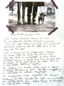
Erwitt_web

Writing about Erwitt

Exercise: Look carefully at Erwitt’s image, ‘New York, 1974’ make some notes about the structure and the meaning of the photograph.

I did this exercise in my sketchbook early on in Part Four of Context & Narrative, I have found that the physicality of sticking images and writing about them is helpful. For the most part I think I found the compositional elements referred to in the module text – the rule of thirds, possibly a triangular composition, leading lines and so on. The use of juxtaposition is clearly an important visual tool in creating possible confusion in the viewer. For me it took a second to spot the taller dog’s legs and realise it was not two humans standing with the small dog.

I found myself drawn to the eyes of the small dog before I could move on to reading the rest of the photograph. This might be explained by neuroscience’s view that we are hardwired to respond to faces . Now I have come back to my notes I’m not sure I see anything differently so much as having a new language to describe them, i.e., the large dog legs becoming a punctum for me.

If there is a difference it may be that I am more aware of the relationship between denotation and connotation, of what we read into photographs beyond their immediate form. With New York 1974 I now find myself wondering about different metaphors that could be applied in terms of signification – it could be saying something about power relationships, about the human animal, relationships, wealth and exploitation. A myriad of different interpretations could emerge dependent on the context from which I am reading the image.

Studio Playtime

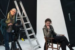
After a week where I seemed glued to a keyboard and screen it was a real treat to pack my photography bags and head over to Wokingham and 10-Studio to meet some of my fellow OCA travellers. I haven’t spent very much time in a professional studio so it was a great opportunity just to be in the environment and see what happened. There is a lot to be said for serious play and plenty of evidence that adults need to do it as much as children.

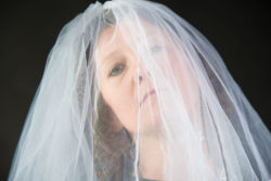
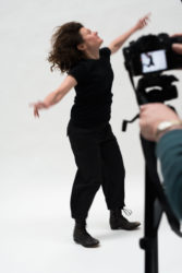
The studio is in a small industrial park in a good size unit with plenty of space to work. When we were there it had two portrait studio type areas and two product areas. I met up with Holly, Richard, Sarah-Jane and Catherine and we had already had some conversations beforehand about what we might work on – I wanted to have another go at my veil portrait series, Richard wanted help throwing things into shot and Sarah-Jane decided to try something with movement.

It is surprising how much you can cram into two hours! We experimented with the lights, with the skylight blinds closed and open, with shutter speeds, apertures and angles. Sarah-Jane kindly agreed to be my veil wearer and I am pleased to now feel like I have completed that Gestalt. It was something I started as a possible self-portrait project for C&N Assignment three but never quite materialised and I got more interested in the composite work I eventually submitted. It has however niggled me ever since that I didn’t really finish the series so this was a prime opportunity.

Everyone graciously helped me set up and we all took some shots. We then moved on to the other projects, which allowed us all to take photographs we might not otherwise have taken and to hear more about what each of us was doing in terms of developing our photography as well as working on our course work. I tend not to do much work with movement so it was really helpful to see Richard and Sarah-Jane develop their shots and hear about what they were trying to achieve.

Apart from having the opportunity to pick up the camera again after what feels like a few fallow weeks given I am now working on C&N assignment four, the trip reminded me of the value of social learning. While we share a lot through the OCA Facebook groups there is nothing quite like being with other people and hearing different perspectives on photography. An important part of finding our photographic voice seems to me to be about putting our ideas and work out there to see how others respond – however scary that sometimes feels.

Thanks to 10-Studio for allowing us to use the space and to Sarah-Jane for organising the session. I really appreciated the opportunity to work with everyone and look forward to the next one!

Shortlisting for assignment four

Deciding on a single image for assignment four was unsurprisingly a challenging task, the volume of choice was potentially paralysing. Should it be old or new, iconic or unknown, personal or in the public domain, black and white or colour…?

In an attempt to narrow things down my thoughts went to photographers rather than images and I tried to compile a shortlist, those photographers whose work has influenced me in some ways over the years:

  • Ansel Adams
  • Anne Zahalka
  • Bill Perroneau
  • Tim Flach
  • Laura Letinsky
  • Olivia Parker
  • Jo Spence
  • Marianne Drew
  • Joy Gregory
  • Gregory Crewdson

I realised as the list unfolded that I had a definite leaning towards more contemporary photographers. These were also photographers whose works I felt I had a strong emotional connection with. In the case of four of them I am fortunate to have their work in my home and have been living with them for some years, ironically I decided this familiarity was perhaps not so helpful and that encouraged me to exclude them.

I was therefore erring towards a living photographer, someone who I could potentially contact to discuss their work, rather than one of the ‘greats’. I decided not to work with a personal image, partly because I was mindful of putting it on the blog, but perhaps I did want a photograph that may not be widely known.

While I was researching ideas for assignment three I had been looking at magical realism and I’m not quite sure why it came up but as part of an online search I discovered the work of Dara Scully. I was completely captivated by her work, and the series with children was unlike anything else I had seen. I recognised something personal in their light and dark emotional field. I revisited the series and thought “The Cut’ was the image I wanted to work with. Initially I was concerned that this might not be acceptable because it was a single figure with shallow depth of field but I put a print on the wall and lived with it for a while. Slowly a wide range of themes emerged, every time I saw it something new came to mind. I was sure this was the photograph I wanted to explore.


Decoding the decoding: Liz Jobey review of a Young Brooklyn Family

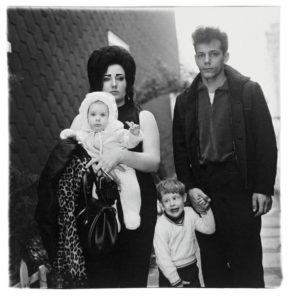
A young Brooklyn family going for a Sunday outing, N.Y.C. Arbus, 1966

A young Brooklyn family going for a Sunday outing, N.Y.C. Arbus, 1966

The fictions we make about photographs are as unreliable as they are unavoidable.(Jobey, 2005)

This review for me started well with this opening statement, it highlights the interpretative nature of ‘reading’ photographs and reflected some of the critiques I have been looking at in terms of semiotics. However, from this point forward I find myself getting increasingly frustrated about what is to me an apparent melange of denotation and connotation with one sometimes being presented as the other.

Jobey starts with a mix of description and interpretation of the image. Highlighting how the viewer might imagine the lives and futures of the family in the photograph – ‘you can’t help wondering what will become of them.’ In the next few sentences it seems clear the assumption of the reviewer is that their futures are not likely to be bright. The review then moves through a series of phases:

  • Some background to the image
  • Denotation
  • Placing Arbus in context and biographical information
  • Arbus backstory
  • Different perspectives on Arbus’ wider body of work
  • Legacy
  • Denotation
  • Concluding connotation and wider social context

From my perspective the flow is not always clear and moves in and out of the image in an attempt to place both Arbus and the photograph in context. It was not so much the structure that troubled me as some of the statements, which for me blurred the lines between fact and interpretation. Statements like:

  • ‘…you can’t help wondering…’
  • ‘We pity them partly…’
  • ‘…her bland white baby…’
  • ‘They look or their marriage looks, already exhausted…’
  • ‘What is clear…’
  • ‘What is disturbing…’
  • ‘…her appearance seems absurd…’
  • ‘…its power comes from the ordinariness they dispute…’

I highlight these phrases because of their resoluteness and the sense of assuming I as the reader/viewer am complicit in these understandings. In my case there were several points where I did not make the interpretation apparently being made for me and where I felt unsubstantiated projections were being made. Only a couple of times does Jobey allude to an interpretation by saying ‘his expression suggests’ or ‘it is an extension of the impression given’. At no point does she appear to own her interpretations and place them in the first person.

I appreciate it may seem that there is an impertinence in my critique of Jobey’s essay, it is after all a comprehensive review, but going through this process has helped me in thinking about the importance of language and the recognition of the interpretative nature of semiotics. I needed to understand the source of my irritation in reading some of the passages. It has also highlighted the challenge of making personal interpretations and assuming that they can be generalised, something that other social science research methodologies have been grappling with for years in a way I haven’t yet seen to the same degree in this field.

References:

Jobey, L. (2005). A young Brooklyn family going for a Sunday outing , N.Y.C. 1966. In S. Howarth (Ed.), Singular Images: Essays on remarkable photographs (pp. 67-76). London: Tate Publishing.


Plastic Vanitas – Mariele Neudecker

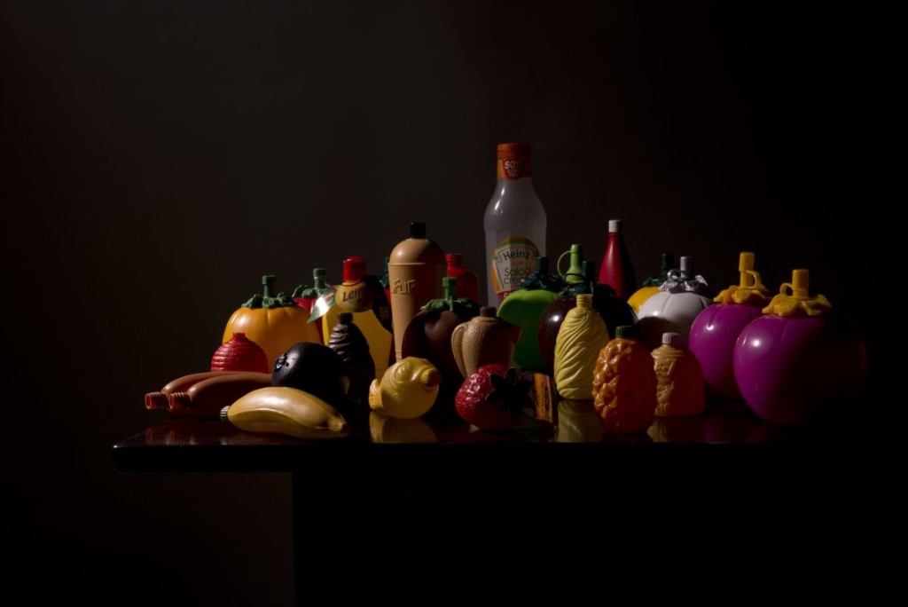
Still life of plastic containers with dark backdrop

Mariele Neudecker, Still Life with Ketchup Bottle and Lemon [AIBDC, 92, CR, 31, Shelf 7 of 8, 0.8kg], 2015

I have always been an avid biker, for many years bikes were my only form of transport. This meant I had friends and family who were bikers too and we would all hang out together whenever the weather was vaguely accommodating. The trips we would head out on generally involved stopping for food at a roadside café, often the only places that were willing to let us stop however respectable the bikes or their riders.

Surprisingly, this is where I went when I saw Neudecker’s Still Life with Ketchup Bottle and Lemon [AIBDC, 92, CR, 31, Shelf 7 of 8, 0.8kg]. Those once ubiquitous squeezy ketchup bottles that resembled a large stylised tomato. I remember them as being made of quite a hard plastic that was often difficult to squeeze and filled with a distinctly vinegar tasting ketchup. It felt like a reminder of a different age and yet the symbols live on, the exhibition title of Plastic Vanitas seemed very appropriate.

Plastic Vanitas is the result of a residency Neudecker took part in at the Museum of Design in Plastic and the Arts University, Bournemouth. Born in Germany, she has lived and worked in Bristol since 2001. She completed a BA at Goldsmiths, an MA at Chelsea College of Art & design and took a course in digital image creation/ manipulation at Tower Hamlets College. She has been exhibited and published widely as well as lecturing and participating in conferences. I think all aspects of her training and experience are exposed in the images in this exhibition.

The exhibition of 49 images was curated by Prof. Susan Lambert (Head of MoDiP) and consists of photographic works in a range of frames, most of which look traditional and slightly ornate. The Vanitas still life tradition originated in Northern Europe in the late 1520s and was associated with a verse from the Old Testament book of Ecclesiastes (1:2; 12:8): ‘Vanitas vanitatum… et omnia vanitas’, translated ‘vanity of vanities, all is vanity’. Strongly symbolic in nature a Vanitas image contains a range of signs originally informed by early Christianity that highlight the perils of vanity, the transience of life and the inescapability of death.

A vanitas painting tries to convey the essential meaninglessness of earthly goods and pursuits, when compared with the eternal nature of true Christian values.  Visual Arts Cork

Still life with skull, books, shell and pot

Vanitas Still Life by Herman Steenwijck, 1640


At its height in the 17th Century in the Netherlands these paintings originally included symbols such as a skull signifying death; books or maps highlighting secular knowledge; fruit and flowers that will inevitably wilt; and jewellery showing wealth and power. Neudecker has taken a more contemporary set of symbols and applied them in such a way that challenges us to examine our individual lives but also to take a macro perspective and contemplate what these images mean in relation to the planet we inhabit.

…The vanitas paradigm shines a new light literally and metaphorically on these mundane objects. Individually they are redefined as contributors to life’s precarious mortality. Carmen curlers are no longer useful beauty aids but instead emblems of vanity; a protective hockey helmet becomes a spectre of what might happen were it not worn; clocks become the harbingers of life’s brevity; and so on. The compositions as a whole act as allegories of the challenges that face our world with its dwindling resources. Prof. Lambert

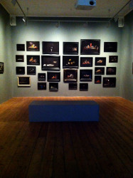
Pictures hanging on an end wall in a gallery

Neudecker, Plastic Vanitas at Bow Arts, 2016


The low lighting in the gallery meant initially I had to check my glasses as they were still dark from the outside sun. The subdued light, the beauty of the images and the hanging of the work ensured I spent time really observing. As I mentioned earlier my initial response was about spotting those items that were familiar or prompted a memory, ‘when we find a photograph meaningful, we are lending it a past and a future.’ Berger & Mohr, 1982: 89

There was also a slight sense of illusion contained within the images, for a while I was not sure I was really seeing what my brain was telling me I was seeing. I should have been looking at Dutch old masters, traditional still lives, but here were collections of plastic objects.

I was particularly struck by the contradictory notion of transience held within these images. The still lives clearly come from a symbolic tradition that highlight the issue of human vanity and our impermanence as human beings yet many of the objects used are now known to have an almost indefinite shelf life. These plastics will outlive me by generations. They are both meaningful and meaningless, many of them are now regarded as obsolete. Fashion and production techniques have moved on yet the physical presence of these objects highlights how humanity’s vanity and thoughtlessness has created an environmental crisis, the potential for transience on a global scale.

Acknowledgement: I would like to thank Mariele for her permission to feature ‘Still Life with Ketchup Bottle and Lemon’ on my blog

References:

Berger, J., & Mohr, J. (1982). Another way of telling. London: Writers and Readers Publishing Cooperative Society.
http://www.visual-arts-cork.com/definitions/vanitas-painting.htm
http://bowarts.org/sites/default/files/NUNNERY_PlasticVanitas_PR.pdf
http://aub.ac.uk/exhibition/plastic-vanitas/