Assignment 5: Tutor feedback reflections

In reflecting on this fifth, and final, assignment feedback from my tutor I find I am thinking about both my latest submission and my progress throughout Context and Narrative. It has felt very different to my first course (The Art of Photography) and while it has been a bit of a roller coaster it has stretched me in ways I might not have imagined at the beginning.

When I set out to develop Assignment 5 I knew that ‘Plastic Vanitas’ was going to have a strong influence I just wasn’t sure of the direction it would take. As the research process developed and I talked with fellow students the concept became clearer in my mind, I even did a quick sketch in my notebook. My challenge then became how to execute it technically. This took a lot of refining, practice and trial and error but by the end I was very pleased with the result. It was gratifying to have the outcome endorsed by my tutor.

Very competent technical and visual skills…The images are constructed so seamlessly that they could almost be a still life and not a constructed image, really well done for making the work so flawless.

Initially I was thinking of producing one image but after feedback from the Thames Valley Photography group I decided to go for three, each working with a different set of symbols. In each I wanted to acknowledge the early tradition of Vanitas and build on it with personal and contemporary references. I was pleased to read that the thought I felt I had put into each image was observable by others.

There is a fascinating mixture of traditional symbols, personal symbols and conceptual symbols in your work, it really shows you have thought a lot about every single element of the image and they are all the more fascinating when you read the ideas behind them.

This, of all my C&N assignments, definitely felt like the biggest leap forward in terms of developing my own style and voice. Once I had got past the fear of whether I had the skills to achieve what I was looking for I felt able to develop each of the images. It did feel like I was taking a risk both in terms of the kind of work I was producing and whether composite was acceptable as ‘constructed’ in terms of the assignment brief. I appreciate that my tutor recognised I had been experimental and that what was produced was something distinctive.

You have definitely been imaginative, experimental and shown a strong development of a personal voice in this assignment…The work has been so carefully considered that nobody else could possibly have come up with the same ideas, it is very personal indeed.

Throughout C&N I have expanded the scope of my research, built my knowledge of the work of other photographers (many of whom I had not come across before), and really thought about how I want to build my practice as a photographer. I have increasingly turned to my sketchbook and tested a range of ideas which I think is reflected in the development of A5.

Very personal and reflective as well as being thorough analysis of where you were at each stage. It really feels like looking through a digital sketchbook which is great.

In the feedback my tutor did raise an interesting point about possibly developing this work, which I have thought long and hard about and talked to other students about.

I think looking at combining text with your images as a diptych might really work for this piece.

My challenge is that the images are quite dense with connotations and were not conceived of with additional text. I am not sure what text would be appropriate and as a result at this point in time I have chosen not to rework them as image/text diptychs.

Assignment 5 Reflections

Title: Making it up – ‘Impermanence and Mortality’

Demonstration of technical and visual skills

The whole process of developing ‘Impermanence and Mortality’ has served to develop my technical skills. It has pushed my still life skills in terms of taking each of the shots (at least ten individual shoots make up each image) and having to consider angle, lighting and depth of field to ensure they would fit within the overall composite. In creating the final images I had to focus on composition and balance, thinking carefully about where I placed each object, colour combinations and so on. It has also developed my Photoshop skills much further than I could have imagined – using the pen tool for cutting out (instead of quick selection), blurring borders slightly so the overlay is more effective, creating shadows with the burn tool and brush and so on. Having a clear sense of what I wanted to achieve as a result of the development process really helped ensure my technical skills were used appropriately. It definitely feels like a case of practice, practice and more practice!

Quality of outcome

I think the research process really helped me achieve the best outcome I could. Looking at some of the Vanitas paintings and becoming more familiar with the original symbolism helped me in relating that to a contemporary context. I am particularly pleased with the development from the early sketches that were little more than copying the genre to something that feels much more like my own distinctive approach. Feedback from other OCA students through Facebook seems to suggest that the conceptualisation of the ideas worked for them – they mentioned being drawn in by the images and wanting to know more, feeling I had met my intention, that the images were strong and that the Vanitas symbolism worked well. They also offered advice on areas for improvement.

Demonstration of creativity

I feel that of all my Context and Narrative assignments this is the most creative. In my view it has built on the previous submissions but then takes the approach to a new level. I was concerned that I didn’t have the skills to achieve what I had in my mind’s eye but I think by building on each stage in the development process I was able to grow my confidence and move towards the images I wanted. This was helped by feedback from the Thames Valley Photography Group who asked some very helpful questions after I had completed the earlier sketches. It was this feedback that led me to think of the series of three. Each stage in the process helped push my imagination and I had not come across a concept like this anywhere else, although it is sometimes hard when you are working on your own because I wasn’t sure if I was straying too far from the brief. This is partly why I sought out other feedback to see what meaning others might take from the series.

Context

This assignment is the result of dedicated reflection and research. It involved a lot of thinking about my own mortality and was personally quite challenging particularly as I have lost many close relatives in recent years and in the week I was finalising the images I got the news that a friend who is two years younger than me had died of Leukemia. It was actually Mother Earth I found hardest because it was difficult not to feel a sense of hopelessness, it was partly why I wanted to create something that I hoped looked quite beautiful but when you look closely there is an inherent ugliness.

In terms of critical thinking a number of themes and emotions surfaced during this assignment, all of which could lead me to further research and development:

  • Humankind’s relationship to materiality, consumption and possessions
  • The potential for objects to instill a sense of melancholy
  • Interest in the proposition that still life as a genre is under theorised
  • Anger about the gender gap that appears steadfast in the arts
  • Anger and sadness about our arrogance as a species

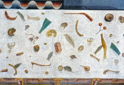
As shown in my learning log my research took me from Roman mosaics to the work of Olivia Parker and many in between. I spent some time researching the Vanitas still life tradition, which is what led me to the women artists of the period. As usual I continued to use my Pinterest Boards (Still Life, Still Life Photography, Impermanence) to collect examples and really expanded the use of my sketchbook during this period.

Decoding the Vanitas

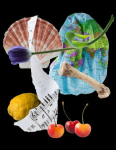
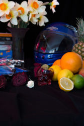
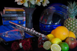
Different objects on a black background - a bone, tulip, music score, cherries & lemon

Decoding the Vanitas

In creating the Vanitas series I took some time thinking about the denotations and connotations I wanted to use. While I want the viewer to draw their own conclusions from the images the following gives some background to why I have included the elements and objects I have.

Contemplating Mortality

Stems from my own mortality and answering the question –  ‘what are your vanities?’

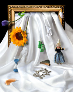
  • Frame: References how we frame our lives and the frames of references we use, also consideration of whether we are reframing mortality with the digital afterlife
  • Satin cloth: the flow of life with all its ups and downs, folds and wrinkles
  • Dutch doll (an obvious link to the origins of the genre) and the book: Both given to me by relatives (my Dad and my Nanny Langley) who have been dead for some years. The book refers to early Vanitas in that knowledge was regarded as temporary and a vanity
  • Cut Flowers: Both flowers represent the frailty of life, as cut flowers they will soon fade. The Tulip references historical Vanitas and the Sunflower is my favourite flower, a personal vanity
  • Boxing gloves: My amateur boxing award, the vanity of ‘success.’ Also about corporeal frailty and the mixed attitudes around women boxing
  • Alice’s Adventures in Wonderland charm bracelet: jewellery as one of my vanities, but also a metaphor for my research work (the vanity of knowledge), Alice has featured symbolically in a number of my papers and is part of my business website
  • Music score: Music is ephemeral once played, and I play the flute badly
  • Hex Bug mouse (a cat toy): Recognition of my aging being measured in cat ownership – I will be in my seventies if my two Maine Coons live as long as some of my moggies did.
  • Pixelated shell: Speaks of the growing industry around digital afterlife (there are over 30 million Facebook accounts belonging to dead people). It also represents death and refers back to Vanitas when exotic shells were included as a symbol of wealth.
  • Egg timer: the passage of time

Feminist and Feminine

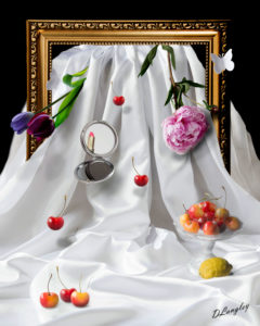
  • Frame: It is a formal and slightly ornate frame as an historical reference. The breaking of the frame is acknowledgement of the early women artists challenging the art system in their own ways
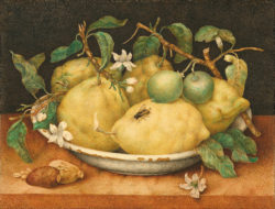
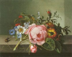
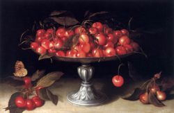
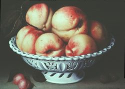
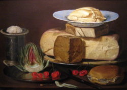
  • Cherries and Lemon: references to Clara Peeters (1580/1590 – in or around 1621), Fede Galizia (1578 – 1630), Giovanna Garzoni (1600-1670), and Rachel Ruysch (1664 – 1750)
  • Satin cloth: A reference to bridal wear or maybe virginity
  • Peony: a ‘blousy’ flower speaking of the softly feminine and acknowledging earlier Vanitas. As a flower it also has a lifecycle
  • Butterflies: Also an earlier reference but they are left blank in recognition of these women often being ignored and side-lined in historical accounts
  • My signature: Added, because I can do so without recourse to another authority. Something early women painters could not do unless they were allowed to join a Guild or were accepted into the Academy
  • Compact mirror: A reference to Vanitas symbolism (the mirror directly representing vanity) and the complex relationship between femininity, feminism and gender stereotyping

Mother Earth

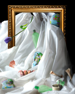
  • Frame: Frames of reference with regard to the climate change debate and the challenge of changing behaviours
  • Earth: an inflatable globe showing the decline of the planet
  • Tulip: The influence of capitalism, the Tulip being a symbol of the first big economic crash
  • Plastic bottles and the tin: mass production and mass consumption
  • Flat peaches in a packet: Our increasingly distanced relationship to food , nature and our environment in the West
  • Shell: The impact we are having on the sea. Shells were once included as a demonstration of wealth and vanity they are now part of mass consumption and can be bought cheaply online for fish tanks. This is having an impact on our seas
  • Plastic cloth: In this image the backdrop is a deliberately more chaotic plastic cloth. The cloth will most likely outlive me and is also about the impact of mass production of plastics
  • Bones: Symbols of death. They are chicken bones so they also relate to mass production and humankind attitudes to other animals


Project 2: The Archive – Question for Seller Exercise

Question for Seller re-situates images in a different context and allows for a new dialogue. Reflect on:

  • Does their presence on a gallery wall give these images elevated status?
  • Where does their meaning derive from?
  • When they are sold (again on eBay, via auction direct from the gallery) is their value increased by the fact that they are now ‘art’?

The challenge for me in the first question is the word ‘elevated’ that in some way implies that the images have become more important and as a result have a heightened status.  I think the gallery context does give them a different status as they enter into the institution and the wider art market. They may have acquired a new value financially but this may not compare with their emotional value in terms of their original owners.

The meaning of the images is derived from both their past and present. In some cases it is drawn from what is known of the provenance of the images, this is then layered with any memories and nostalgia the viewer may project onto them. Finally, the presence on the gallery wall and interpretative materials adds a third layer of meaning in terms of how the viewer interacts with them.

My response to the final question is in part reflected in my answer to the first. I think their financial value is changed through the intervention of the artist and their entry into the gallery system. I also think that the fact that the sale was an interactive part of the exhibition and participants could see how the auction was unfolding may have had an impact on the value. It is possible, in my mind, that people participating in bidding who might not otherwise have done so had they appeared on eBay some time later. So for me there is also a psycho-social element that may have increased their value as well as their new status as ‘art’.

Project 1: Research Point – Gregory Crewdson

Watch the YouTube video about Gregory Crewdson and consider the following:

  • Do you think there is more to his work than aesthetic beauty?
  • Do you think Crewdson succeeds in making his work ‘psychological’? What does this mean?
  • What is your main goal in making pictures? Do you think there is anything wrong with making beauty your main goal? Why, or why not?

Crewdson himself talks about there being more to his work that aesthetic beauty, ‘first and foremost a beautiful aesthetic is not enough.’ He highlights his father’s influence and childhood memories of endeavouring to listen into his therapy conversations. His father was a psychoanalytic therapist and I definitely get the sense of his work trying to reach beneath the surface into the unconscious realm.

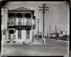
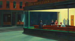
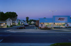
I find there is an eeriness to his work, an odd stillness (perhaps induced by the cinematic look) that speaks of either an event that has just occurred or some sort of peril yet to come. I find his images very evocative; they make me stop, think and wonder. I think this also gives them a depth that is absorbing on many layers. As a viewer I find I am often concerned about the personal stories they contain (why do so many of his figures not have shoes on?), but also with Crewdson’s intentions. There is something quite Hitchcockian in his use of the vernacular and he talks about the influence of Hopper and Walker Evans. Although things appear ordinary on the surface there is a sense of the uncanny, something mysterious and possibly menacing.

I have seen several of his documentaries and that leads me to wonder about the production that sits behind each image and the scale of the commitment and preparation they require. Not only does significant preparation go into finding the right locations and creating the set, Crewdson talks about using light and colour to then tell the story. I was interested to learn that the final images are then a composite from across the shoot as a whole – he never uses a single image.

I think the goals for my photography vary dependent on the nature of the work I am involved with but for the most part it is some sort of balance between beauty and story telling. I can also envisage there might be times when I want to provoke or even shock and that could be more about ugliness than beauty.

I don’t see any issue with beauty being the main goal if that is the kind of work you are looking to produce. To me it is an issue of intention and context.


Assignment 5: Making it up – Impermanence and Mortality

“The Vanitas still life painting is designed to remind the viewer that death frames our possession of the object world; indeed that our possessions are capable of outliving us, thus rendering the ownership of things illusory.” (Wynne, 2016)

Inspired by a visit to Bow Arts to see Neudecker’s Plastic Vanitas this series draws on the tradition of Vanitas still life to explore notions of impermanence and mortality.

Contemplating Impermanence is a personal journey through mortality. It echoes some of the original Vanitas symbolism combined with personal objects (detailed connotations are included in my learning log). This image includes items that were given to me by family members who have been dead for some time and now have a potency for me that sits at the intersection of life and death. The pixelated shell questions how we might be re-framing our lives and mortality given the growing industry around digital afterlife (there are now over 30 million Facebook accounts belonging to dead people).

Feminist and Feminine is a statement about the role of women in art and the relationship of women artists to still life. It contains references to some of the major female still life painters from the 16th – 18th Centuries. It also raises issues of feminism and femininity. The breaking of the frame in this image, is about flow through time, and acknowledges how these women challenged the system in their own ways. My signature is added, because I can do so without recourse to another authority. Something early women painters could not do unless they were allowed to join a Guild or were accepted into the Academy.

Mother Earth takes me to the ultimate issue of impermanence, and references the actions and impact of humankind on our planet. The influence of capitalism (the Tulip), mass production (plastics) and mass consumption (rubbish). Our increasingly distanced relationship in the West to food (flat peaches in plastic). The impact we are having on land and sea (the shell and plastics). In this image the backdrop is a deliberately more chaotic plastic cloth.

Acknowledgements:

  • Mariele Neudecker for her permission to feature her images in my learning log
  • The women who broke new ground – Rachel Ruysch, Clara Peeters, Giovanna Garzoni and Fede Galizia
  • The Thames Valley Group and FB OCA Photography Level 1 Group

References and citations

Wynne, D. (2016). Women and personal property in the Victorian novel. London: Routledge.


Assignment 5: The ‘Impermanence and Mortality’ development process

Plastic Vanitas’ was very thought provoking. Having done previous assignments on fertility (assignment two), and my life (assignment three) it seemed like a natural next step to be considering death in my final assignment.

I started by creating some personal Vanitas still lives, using contemporary connotations to recreate the original style. These never became more than quick ‘sketches’ because I knew very quickly this approach was not distinctive enough. I also wanted something that looked and felt more contemporary while still using the signification of the original genre. One of the issues for me was that that the first sketches felt too cluttered so the next step was to strip everything back and using fewer referents see if I could achieve a similar signification.

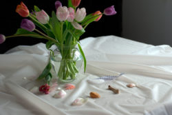
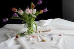
I worked with Tulips because of their links to the Dutch Vanitas tradition (1600 -1800) and also because they could show the signs of decay as the petals fall. The Shell and bone, also elements of life and death, were placed sparingly on a crumpled white cloth a connotation of the peaks and troughs of life. This felt more along the lines of what I was trying to achieve and while I was happier with these results it still felt as though I hadn’t pushed it far enough.

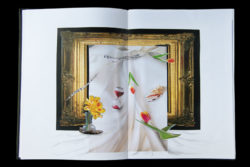
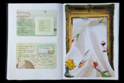
In looking again at some of the original Vanitas paintings I started to think more about the frame, and how in some of the earlier paintings the elements deliberately flow forward, off the table and to the edge of the frame. Framing in both physical and metaphorical terms became the key to the next transition. The ‘frame’ became important in terms of it being a mechanism for containing the image; referring to different frames of reference; considering how we frame our lives (from birth to death) and so on. I had recently done a Photoshop exercise on creating the illusion of breaking through the image plane and decided this was the next step.

I wanted to see if I could create an image that made direct reference to challenging the boundary of the frame, therein representing the passage of time from birth to death and whatever lies beyond. In this I was also drawing on Schaverien’s (1999) psychoanalytic notion of the photographic frame creating a safe container for our anxieties, I wanted to break that safety and see what happened when the elements flowed out.


Before even attempting it in Photoshop I then made some physical collages using some of the elements in my sketchbook. This was particularly helpful in deciding whether they should be portrait or landscape. It also reinforced the need for the black background rather than white. I showed my sketchbook and first digital attempts to the Thames Valley Photography group and got some very helpful feedback:

  • Consider if I was moving too far from the original Vanitas inspiration
  • Perhaps make it more personal – what are my vanities?
  • Think about drawing out the feminist issues further
  • Consider making a physical collage of the photographs rather than doing it in Photoshop

This led me to thinking about producing the series of three rather than a single image. The themes arose from our group discussion and I then worked on them in my sketchbook, creating a list of possible symbols under each theme. The idea of considering individual, group and global mortality really appealed to me and while I initially waivered because of the amount of work involved for each image I decided I wanted to give it a try. The props were a mix of those I had around my home and a few that I purchase specially, including the cut flowers. I found I had chosen to do this right at the end of the Tulip season so could not access the more exotic varieties I had wanted and had to work quickly with those I did manage to find! All the props were then shot individually in natural light on a table top infinity background.

While continuing to be still lives I have tried to introduce a sense of movement, a flow through time. I wasn’t sure if I could achieve it with my Photoshop skills but I have come pretty close to what I was hoping to achieve. I may still move on to create further physical collages. Looking back it feels like the development process has a natural flow to it and the combination of research, talking to other students and experimenting feels like it paid off.

Acknowledgements:

  • Mariele Neudecker for her permission to feature her images in my learning log
  • The women who broke new ground – Rachel Ruysch, Clara Peeters, Giovanna Garzoni and Fede Galizia
  • The Thames Valley Group and FB OCA Photography Level 1 Group

References and citations

Schaverien, J. (1999). The Revealing Image: Analytical Art Psychotherapy in Theory and in Practice. London: Routledge.

Wynne, D. (2016). Women and personal property in the Victorian novel. London: Routledge.


Under the Influence

Having got to the point where I feel I have nearly finished the final C&N assignment it has been useful to look at what I felt have been some of the key influences in shaping my approach. There have been several quite diverse influences that have informed my thinking about this final body of work from Roman mosaics and 17th Century painting to contemporary photographers.

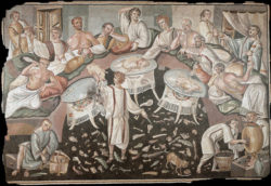
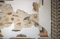
The unswept floor mosaics of Italy and Switzerland are fascinating in terms of possibly being a record of the time and visually in their composition. They are said to depict the items discarded during a feast hence their somewhat random placing. They also denote the wealth of feast holder and diners. Connotations picked up again in the 17th & 18th Century still life paintings in Europe.

I am astounded by the beauty and quality of the 17th and 18th Century paintings created by the women still life painters of Northern Europe especially Fede Galizia, Giovanna Garzoni and Rachel Ruysch. There were a number of very successful women artists in the field and it has felt important to make a connection with them.

In terms of contemporary still life photography two women have been particularly influential – Olivia Parker and Laura Letinsky. I came across Olivia Parker’s work early on in C&N and it is a body of work I have continually returned to. For Assignment 5 I was particularly interested in the ‘Not so Still Life’ series. I really admire the quality and atmosphere in her work but I was very struck by this notion of movement within the still life genre.

Laura Letinsky’s still lives, have been influential because of the way she has experimented with the genre; using different visual planes and angles, thinking about what is left behind after the meal (interesting for me in terms of impermanence), and the distinctive quality of light in her work.

I have also used my Pinterest boards throughout to keep collecting different examples and help me build my ideas – still life board & Impermanence and Still Life Photography

Women & Still Life

Thus the question of women’s equality—in art as in any other realm—devolves not upon the relative benevolence or ill-will of individual men, nor the self-confidence or abjectness of individual women, but rather on the very nature of our institutional structures themselves and the view of reality which they impose on the human beings who are part of them. (Nochlin, 1971)

“The art market is not sexist,” Mr. Sewell said. “The likes of Bridget Riley and Louise Bourgeois are of the second and third rank. There has never been a first-rank woman artist.

“Only men are capable of aesthetic greatness. Women make up 50 per cent or more of classes at art school. Yet they fade away in their late 20s or 30s. Maybe it’s something to do with bearing children.” (Johnson, 2008)

An audit of the art world shows that every artist in the top 100 auction sales last year was a man, and just 8% of public art in central London was created by women. (Cochrane, 2013)

Perhaps I was naïve to think that in the 21st Century things had moved on for women artists but it seems that progress has actually been pretty slow. On the one hand it seems that there are more opportunities but on the other women are still underrepresented in the major institutions.

Delving into the world of historical Vanitas still life has been fascinating and has prompted this reflection on the position of women in art. I have some familiarity with art history and was aware that most of the artists presented as ‘great’ are men. What I am ashamed to say I wasn’t aware of was some of the women I came across in relation to the tradition of still life painting. Looking at some of the books on still life painting I have used for research for assignment five it would seem I am not the only one!

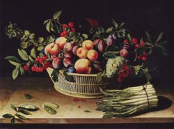
I am now happy to be acquainted with Fede Galizia, Clara Peeters, Louise Moillon, Rachel Ruysch, Marie Louise Elizabeth Vigee-LeBrun, Maria van Oosterwijck and Ann Vallayer Coster; 17th and 18th Century artists whose work appears to have been prolific and successful. I didn’t necessarily set out to consider the gendered nature of artworks and the artworld, to a certain extent it found me. What most intrigued me was the fact that there were a number of accomplished women still life painters because for the most part it was a form of art they were ‘allowed’ to participate in. It seems that between the Renaissance and the 20th Century, women were not permitted to participate in life drawing which excluded them from the academies and the major art institutions. They were relegated to what was regarded as the lower genre of still life, something more seemly for their gender.

Bryson (1990) argues that because of its low status Still Life is a genre that has been under-theorised, this certainly seems to be the case in relation to women in the field. In looking at the early works of the 17th and 18th Century women I was struck by how familiar they seem and that these objects and forms gave me a way of connecting with them.

The repeated shapes of the things in still life have been decided by consensus over many eras, and feel ‘right’ for the job. As such they create a cultural field far larger than any single individual, or even any particular generation: those addressed by these ancient and familiar forms are only the present members of a cultural family whose roots travel back into a vast preceding cultural community, which is in solidarity with each of the generations behind and ahead.(Bryson, 1990: 138)

In a small way I wanted my assignment to reach back and respect these women and flow forward into the future of the genre.

References and citations

BRYSON, N. 1990. Looking at the Overlooked: Four essays on still life painting, London, Reaktion Books Ltd.

COCHRANE, K. 2013. Women in art: why are all the ‘great’ artists men? Available: https://www.theguardian.com/lifeandstyle/the-womens-blog-with-jane-martinson/2013/may/24/women-art-great-artists-men [Accessed 18th June 2016].

JOHNSON, A. 2008. There’s never been a great woman artist. Available: http://www.independent.co.uk/arts-entertainment/art/features/theres-never-been-a-great-woman-artist-860865.html [Accessed 18th June 2016].

NOCHLIN, L. 1971. Why have there been no great women artists? Available: http://www.artnews.com/2015/05/30/why-have-there-been-no-great-women-artists/ [Accessed 20th June 2016].


Tutor feedback reflections: Assignment 4

It took some time for me to select the photograph I wanted to focus on because I knew it needed to be a strong image that I would want to spend some time reviewing. I was pleased to find Dara Scully’s work and knew immediately I wanted to look at one of her images, they seemed so multi layered. The choice of the image was noted in my Tutor Feedback.

…you have chosen a really interesting image for this and explored it and other appropriate images in an informative and interesting way.

I looked at a range of advice on reviewing visual arts and photographs and worked through a number of drafts to shape the final version, while the comparative work came later in the process I found it particularly helpful in focussing on why I had selected this particular image. I am pleased my Tutor felt this approach was appropriate.

…an interesting piece of writing relating to this image and similar and indeed very different representations of childhood in photography. Very competent technical and visual skills

I am grateful to the other OCA photography students for their feedback during the drafting process, which helped me refine my thoughts and writing. I think this really helped strengthen my writing and I am glad it came across.

Your work has shown an application of knowledge in terms of both your research and your own interpretation of this image and what it shows. … Highly effective work presented in a professional way, showing strong judgement.

In initial feedback from other OCA photography students there was some debate about the appropriate balance between personal voice and the views of others in the field. I wanted to include an auto-ethnographic element as I felt it was pertinent to both my selection of and response to the image. I took a risk in leaving in my reflective comments and my tutor acknowledged them positively.

…strong evidence of personal voice. Your own opinions on this image stand out as well as using references from other theorists to provide a grounding to your essay.

This was not an easy assignment to achieve within the word count, there was so much I could have said about this image and throughout I had a concern about whether I was pursuing my points clearly. I was very pleased that my tutor felt the review was of an appropriate standard and quality.

Very articulate and self aware, very well researched, demonstrating a developed intellectual understanding

I found this process incredibly valuable in both looking at the work of others and in taking a more critically reflective approach to my own work.