Light: Science and Magic

And then there is light – the collective result of all those busy little photons that buzz around the universe as they have since creation…Light is, always has been, an always will be the very foundation of that amazing amalgamation of arts and science we call photography.” (Hunter, Biver, & Fuqua, 2012:xiii)

‘Light’ starts well for me; it makes it clear it is offering a set of tools not a rulebook or a lecture. It also uses the metaphor of language to describe how light conveys information. Most importantly it stresses the use of this language to develop your own voice and not to copy that of others. The authors make the point that they will be more ‘bored than flattered’ if you try to make images that look like those featured in the book.

This reminded me of some research advice I was once given that copying the great theorists will not earn the respect of those you are copying, nor will it gain you respect in your research field.

They propose that the language of photography is based on three key principles that are informed by physics. Understanding these basic principles, what might be regarded as the science of photography, can then inform the art of photography.

Three principles of light:

  •  Size: the size of the light source determines how the light interacts with the subject/object
  • Reflections: there are three possible types of reflection
    • Diffuse: the same brightness regardless of the viewing angle
    • Direct: produces a mirror image of the light source that produces the reflections
    • Glare (or polarised direct reflection): like direct reflection only one viewer will see the reflection but polarised is always dimmer, a perfect polarised reflection will be half as bright as a polarised reflection
  • Angles: some of the above reflections only occur if the light source is in a certain position, within a limited ‘family of angles.’  This family of angles determine where a light should or should not be when trying to achieve particular lighting effects

References

Hunter, F., Biver, S., & Fuqua, P. (2012). Light Science & Magic: an introduction to photographic lighting (4th ed.). London: Elsevier.


Cartier-Bresson: A Question of Colour

Sadly, I didn’t get to see the exhibition in the flesh but I was told about it by a friend and have since had a chance to track it down online. It was such a shame that I missed it because I think it would have been a really good experience in terms of thinking about colour for this part of the course.

Cartier-Bresson: A Question of Colour features the work of a select number of photographers whose commitment to expression in colour was (or is) wholehearted, sophisticated, and measures up to Cartier-Bresson’s requirement that content and form were in perfect balance.

A Question of Colour included an auspicious group of contemporary colour photographers.

Initially, I was just going to include those photographers/images that particularly resonated with me but as I looked at their different styles and approaches they each offered something new. Those that strike me now, like Trent Park and Carolyn Drake, may not be the ones that have meaning a few months down the line. So I have captured them all for now, leaving myself the option for more research in future.


Technicolour

Green with envy

Purple with rage

Seeing red

Happenstance led me to the BBC Radio 4 Technicolour programme while I was travelling the other week and I have since listened to the whole series. A set of short broadcasts it explores various aspects of our understanding of, and relationship to colour, covering:

  • Vision
  • Naming
  • Feeling
  • Making
  • Selling

The broadcasts cover everything from colour blindness to the environmental impact of the dye trade. During one interview with an interior designer she said:

Nature creates harmonious colours…nature doesn’t get it wrong.

I found this an interesting observation as it was primarily nature that I used in creating the photos for my assignment that required harmony between similar colours.

While this wasn’t a visual experience as such the debate around the socially constructed nature of colour is fascinating, in particular the notion of how or if language affects our perception of colour. I hadn’t realised if but apparently the first word we had for a colour was red, followed by green and yellow and finally blue. I also discovered that the Russian language includes more words for blue than English and psychologists are now studying whether this means that Russian people see colour differently to people with English as their first language.

It also seems that there are some women who have ‘super’ colour vision, these so called Tetrachromats can see four distinct ranges of color, instead of the three that most of us live with. If you are based in the North of England visit the BBC website to find out if you have this superpower!

If you didn’t manage to catch it the series is well worth tracking down on the BBC iPlayer.

Gestalt and the organization of visual perception

There is much to learn from Michael Freeman’s ‘The Photographer’s Eye’ but two things particularly stand out for me so far – Gestalt and Figure/Ground. Now I think about it they probably shouldn’t be a surprise, but these are approaches I use in my consultancy work with organisations and hadn’t really thought about in relation to visual perception.

When I read about it of course it makes perfect sense, and it was fascinating to make the new connection, even if I kick myself for not having thought about it before. One of the things that has always appealed to me about Gestalt is that notion of ‘seeing’ the whole, the need we have as human beings to complete the whole.

Modern Gestalt theory takes a holistic approach to perception, on the basic principle that the whole is greater than the sum of its parts, and that in viewing an entire scene or image, the mind takes a sudden leap from recognizing the individual elements to understanding the scene in its entirety.

Gestalt theory gives us a number of laws of perceptual organization that are important in considering how images might be composed and what is happening perceptually for the viewer:

  1.  Law of proximity: visual elements are grouped in the mind according to how close they are to each other
  2. Law of similarity: elements that are similar in some way, by form or content, tend to be grouped together
  3. Law of closure: elements roughly arranged together are seen to complete an outline shape – the mind seeks completeness
  4. Law of simplicity: the mind tends towards visual explanations that are simple; simple lines, curves and shapes are preferred, as is symmetry and balance
  5. Law of common fate: grouped elements are assumed to move together and behave the same
  6. Law of good continuation: the mind tends to continue shapes and lines beyond their ending points
  7. Law of segregation: in order for a figure to be perceived, it must stand out from its background. Figure-ground images exploit the uncertainty of deciding which is the figure and which is the background, for creative interest

(from Freeman, 2007: 39)

Some graphics examples of these laws at work can be seen at graphicdesign.spokenfalls.edu – I particularly like the WWF Panda logo as an example of how the law of closure works.

Normally, in presenting information, making the viewer’s mind work harder is not considered a good thing, but in photography and other arts it becomes part of the reward for viewing.

Freeman, 2007: 38

A woman photographing women

With an aim to capture the many roles of women in society, Bohm juxtaposes the images of women that surround us in advertising, artworks and shop windows with real women living and working in the capital – revealing the contrasts, similarities and gaps between ideals and expectations of the feminine and real life women in everyday situations.

Museum of London press release

I actually saw the Dorothy Bohm exhibition before I went to the Ansel Adams show but for some reason the writing did not come easily for this visit. I think it is partly because I was disappointed and there seemed to be something disloyal in saying so. Although, the disappointment was less to do with the work and more to do with the way it has been presented. Dorothy is an important photographer but this show might have led you to think otherwise. The light levels were incredibly variable – in one corner I found it was almost too dark to see the images at all. Sandwiched between two interactive spaces and a cafe I found the leaking noise incredibly distracting.

Why bother going into this much detail about the presentation? Because for me it really highlighted the delicate relationship between photographer, image and viewer. My ability to ‘read’ the work was significantly influenced by the setting in which I found it. In this setting it was hard to see Dorothy’s work for the position it should occupy and in a sense it almost reinforced the sense of invisibleness of the women I felt in some of her images.

 As a woman photographing women, I hope that I have shown in my pictures that I understand, sympathize and can identify with my subjects. I never want to take hurtful pictures. I have tried to show the contribution women make to the very diverse, exciting, colourful if sometimes stressful London life

Dorothy Bohm

There is a sensitivity in these images and a keen eye for the extraordinary in the ordinary. On this basis the images seem to straddle photo documentary, ethnography, and portraiture. Some of the images made me smile and overall it was good to see a show by a woman of women.

The photograph fulfills my deep need to stop things from disappearing. It makes transience less painful and retains come of the special magic, which I have looked for and found. I have tried to create order out of chaos, to find stability in flux and beauty in the most unlikely places.

Dorothy Bohm

Equivalenices – Ansel Adams

After what was a pretty rotten morning thanks to train disruptions and general travel woes I was really looking forward to getting to the Ansel Adams show at the National Maritime Museum. I am not sure what I expected and I was intrigued about the link with the NMM, what I found was a truly awe-inspiring. Adams is well known as occupying a significant place in the history of photography, particularly as a consummate technician, but there was something incredibly emotional about being in such close proximity with this collection of prints.

They ranged from very intimate and small early works to enormous prints that I found quite staggering particularly in terms of the technology he had available to create them at the time.

Two things particularly landed with me on leaving the exhibition. Firstly, the notion of equivalencies that he developed from the influence of Stieglitz.

 When I see something I react to it and I state it, and that’s the equivalent of what I felt. So I give it you as a spectator, and you get it or you don’t get it, but there’s nothing on the back of the print that tells you what you should get.

Ansel Adams

I was incredibly struck by his notion of representing what he felt and this was something I don’t think I had truly understood in the way he created his work before.

The other thing that I was intrigued to hear from the film clips and interviews with Adams was this notion of seeing an image in his mind’s eye before he shot it. This is something I have increasingly noticed is important for me when I am doing my assignments and I think is in part why I have struggled with some of the colour exercises. I found it much harder to see beforehand what I was aiming for. To hear him talk of not making a shot before he had seen it in his subconscious was a real revelation.

When words become unclear, I shall focus with photographs. When images become inadequate, I shall be content with silence.

Ansel Adams


Kevin Best

Since finding Olivia Parker I have also come across the work of Kevin Best. I was intrigued by his portfolio because he seems to have taken the Dutch Still Life painting influence to a whole new level. To the extent that he has purchased many authentic props from the era and where these have not been available he has set about making them himself.

As much as anything I was interested in my response to his work. On the one hand they are incredibly detailed and I love the chiaroscuro so redolent of the period he draws his inspiration from. For me however, they don’t have quite the impact of Parker’s work or the delicate contemporary references Anna Zahalka used in her series Resemblance I. I really admire the quality of his work and researching across these photographers has definitely helped me to think about how my own photographic voice might develop.

Olivia Parker

4x5 TransparencyHaving done the exercise around multiple points and setting up a form of still life I started to do some background research on the genre. At first it made me think of Anne Zahalka’s rich and beautiful tableaus and the influences of Dutch still life painting. During a web search I then came across the work of Olivia Parker. I hadn’t come across her photography before and was really taken with her approach.

I found the ‘Still and not so Still Life’ series incredibly beautiful. In one image objects and flowers appear to tumble down the frame. Delicate flecks of colour are highlighted against the almost solid black background. Where other images initially appear more like a traditional still life closer observation often reveals something quirky, surreal or disruptive. Hearts in jars, inverted landscapes reflected in glass bowls, shards of mirror. I found them exquisitely observed and very inspirational. They really encouraged me to think about still life in a new and more creative way. To look carefully at and work with the textures, colours and shapes of the objects I might use in future.

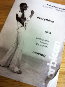
Everything was moving: Photography from the 60s and 70s

Everything-was-movingI was deeply moved by this show and can’t help but feel it will have a long lasting effect. There was, to my view, a stronger narrative thread in the downstairs galleries but that may in part be because a number of the photographers included there were much more familiar to me.

I spent two hours wandering through and thinking about the works and their meanings before I realised what the time was, not something I always experience in exhibitions. It is a multi-layered show touching on the social, political, economic, cultural and psychological. It is also in many ways very confronting, or at least I found it to be, from the appalling injustices of apartheid to Japan post Hiroshima and the impact the US has etched on the country. It certainly put me in mind of Sontag’s point about photography as an act of aggression and how this sat in relation to the fact that the content of many of these images is dealing directly with overt issues of aggression.

As a group show it also provided the opportunity to see a diverse range of techniques and approaches to the art of photography itself. From the hyper-real almost painterly large scale works of Larry Burrows to the sumptuous colour of Raghubir Singh. The works are beautifully observed and capture both the everyday and iconic moments. I couldn’t help but wonder how much the various photographers were aware of these possible distinctions at the time. All dealt with acute issues of the human condition and I think should make us consider where we have come to in the last fifty years. It put me in mind of the TS Eliot Poem Little Gidding, the last of The Four Quartets (1943):

We shall not cease from exploration
And the end of all our exploring
Will be to arrive where we started
And know the place for the first time.

More details on the show can be found on the Barbican’s Everything was Moving web page.


On Photography

On Photography (Sontag, 1979), is one of those titles that is so familiar I felt I knew it before I started. Alright so my first read of it was some years ago now but it has been an interesting reunion. I found I am now reading it wearing different lenses (excuse the pun!) and new aspects stand out for me.

Quite early on an issue struck quite hard, and I know it is something others have picked up on too. She talks of photography as being ‘as much an interpretation of the world, as paintings and drawings. A view that makes perfect sense to me. She then makes a link that has really got me thinking.

“There is an aggression implicit in every use of the camera.”

 It is one of those statements that stops you in your tracks and certainly made me reflect on my approach to the ethics of photography. On closer reading I think she is referring primarily to photographing people, which I must admit is something I tend to shy away from. In part I guess because I loathe having my own photo taken – I never recognise the person looking back at me and I find it very discomforting.

Later in the chapter Sontag (1979: 14) goes on to say:

“To photograph people is to violate them, by seeing them as they never see themselves, by having knowledge for them they can never have; it turns people into objects that can be symbolically possessed.”

This notion sits within the metaphor of the camera as a ‘predatory weapon,’ (Sontag, 1979: 14) a distinctly powerful metaphor that ought to encourage careful reflection on what my camera is ‘aimed’ at and why.


References:

Sontag, S. (1979). On Photography. London: Penguin.