Decoding the Vanitas

Different objects on a black background - a bone, tulip, music score, cherries & lemon

Decoding the Vanitas

In creating the Vanitas series I took some time thinking about the denotations and connotations I wanted to use. While I want the viewer to draw their own conclusions from the images the following gives some background to why I have included the elements and objects I have.

Contemplating Mortality

Stems from my own mortality and answering the question –  ‘what are your vanities?’

  • Frame: References how we frame our lives and the frames of references we use, also consideration of whether we are reframing mortality with the digital afterlife
  • Satin cloth: the flow of life with all its ups and downs, folds and wrinkles
  • Dutch doll (an obvious link to the origins of the genre) and the book: Both given to me by relatives (my Dad and my Nanny Langley) who have been dead for some years. The book refers to early Vanitas in that knowledge was regarded as temporary and a vanity
  • Cut Flowers: Both flowers represent the frailty of life, as cut flowers they will soon fade. The Tulip references historical Vanitas and the Sunflower is my favourite flower, a personal vanity
  • Boxing gloves: My amateur boxing award, the vanity of ‘success.’ Also about corporeal frailty and the mixed attitudes around women boxing
  • Alice’s Adventures in Wonderland charm bracelet: jewellery as one of my vanities, but also a metaphor for my research work (the vanity of knowledge), Alice has featured symbolically in a number of my papers and is part of my business website
  • Music score: Music is ephemeral once played, and I play the flute badly
  • Hex Bug mouse (a cat toy): Recognition of my aging being measured in cat ownership – I will be in my seventies if my two Maine Coons live as long as some of my moggies did.
  • Pixelated shell: Speaks of the growing industry around digital afterlife (there are over 30 million Facebook accounts belonging to dead people). It also represents death and refers back to Vanitas when exotic shells were included as a symbol of wealth.
  • Egg timer: the passage of time

Feminist and Feminine

  • Frame: It is a formal and slightly ornate frame as an historical reference. The breaking of the frame is acknowledgement of the early women artists challenging the art system in their own ways
  • Cherries and Lemon: references to Clara Peeters (1580/1590 – in or around 1621), Fede Galizia (1578 – 1630), Giovanna Garzoni (1600-1670), and Rachel Ruysch (1664 – 1750)
  • Satin cloth: A reference to bridal wear or maybe virginity
  • Peony: a ‘blousy’ flower speaking of the softly feminine and acknowledging earlier Vanitas. As a flower it also has a lifecycle
  • Butterflies: Also an earlier reference but they are left blank in recognition of these women often being ignored and side-lined in historical accounts
  • My signature: Added, because I can do so without recourse to another authority. Something early women painters could not do unless they were allowed to join a Guild or were accepted into the Academy
  • Compact mirror: A reference to Vanitas symbolism (the mirror directly representing vanity) and the complex relationship between femininity, feminism and gender stereotyping
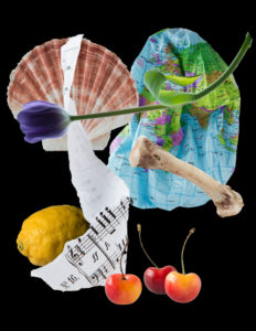
Mother Earth

  • Frame: Frames of reference with regard to the climate change debate and the challenge of changing behaviours
  • Earth: an inflatable globe showing the decline of the planet
  • Tulip: The influence of capitalism, the Tulip being a symbol of the first big economic crash
  • Plastic bottles and the tin: mass production and mass consumption
  • Flat peaches in a packet: Our increasingly distanced relationship to food , nature and our environment in the West
  • Shell: The impact we are having on the sea. Shells were once included as a demonstration of wealth and vanity they are now part of mass consumption and can be bought cheaply online for fish tanks. This is having an impact on our seas
  • Plastic cloth: In this image the backdrop is a deliberately more chaotic plastic cloth. The cloth will most likely outlive me and is also about the impact of mass production of plastics
  • Bones: Symbols of death. They are chicken bones so they also relate to mass production and humankind attitudes to other animals


Project 2 Reading Pictures: Decoding advertising

Exercise: Select an advertising image and write on as many parts of the image as you can. Comment on what it is, what it says about the product, and why you think it’s there. Come back to this exercise when you’ve finished Part Four and see if you can add anything to your analysis.

I got quite absorbed in this exercise and ended up using several examples rather than just one. I deliberately chose a varied set including a few that could be regarded as iconic. I also included a couple that might be thought of as breaking with the norm in terms of advertising including the Dove Real Beauty campaign and Radiance (L’Oreal) with Helen Mirren.

I looked at each in turn and started with an intuitive response, then considered their composition and structure looking at lighting in particular. I also tried to identify the signifiers and signified. The variety in the product placement was interesting, in two cases (Obsession & Radiance) there was no obvious product image included at all. Having done the short course with Karl Taylor in January the No5 ad reminded me that he said he always uses graduated lighting on his products shoots to signify luxury. The ads use a variety of gazes in terms of the models involved, they all include people, and they use a range of backgrounds from solid black to outdoor. Based on my interpretations the ads signified different things depending on the brand (not all I imagine are what the advertisers would want):

  • Dove – all women are beautiful (I have mixed views about the campaign bearing in mind it is still a commercial product)
  • No5 – success, achievement, glamour, aspirational
  • Obsession – danger, intrusive, vulnerability (I still find this ad quite disturbing even more so having read some of its backstory and realising Kate Moss was 17 at the time)
  • Calvin Klein – health and well-being, strength and flexibility, an aspirational body
  • Levis Roadwear – freedom, free spirit, following your dreams
  • Rolex – achievement, success, breaking boundaries and exploration, life changing achievements (There is an odd dissonance in that I had read the figure as Amilia Earhart but the factoid is about the sound barrier being broken in 1947)
  • Radiance – strong, empowered, visibility, self-esteem, growing old with dignity and flair

In looking back at my initial thoughts I think I was reasonably comfortable with reading the advertisements but what I did not have at that point was the language to fully express the relationships between referent systems.

Reading Williamson (1978) and Hall  (2012) highlighted different elements I was able to then apply. The aspect I found most useful from Hall was that of the linking notion or the ‘abstract concepts’ (Hall, 2012: 54) that connect signifier and signified and that this can be thought of in metaphorical terms. For example, the No5 ad with Nicole Kidman where she is placed in metaphorical relationship with the perfume associating it with beauty, glamour and success, Hall describes it in terms of a form of transference.

Having a deeper framework for analysis provided by the reading and the exercises in this section has added to the depth of my understanding. What I found particularly interesting was making comparisons across the set of advertisements to see the different techniques that have been adopted. It seems to me their core referent systems are based around the fact that however sophisticated these signs are they are ultimately designed to sell products and make money for those paying the ad agencies. This in turn ties their reading into wider economic, cultural and social systems.

The decoder of advertisements is no longer a passive colluding reader but a critical reader, revealing and effectively denying the efficacy of the process of meaning transference.(Harvey, 2011)

References and citations

Hall, S. (2012). This Means This This Means That: A user’s guide to semiotics. London: Laurence King Publishing.

Harvey, L. (2011). Class: Judith Williamson – Decoding Advertisements  Retrieved 28th February, 2016, from http://www.qualityresearchinternational.com/csr/classwilliamson.php

Williamson, J. (1978). Decoding Advertisements: Ideology and meaning in advertising. London: Calder and Boyers.


Project 1: The Language of photography – Erwitt exercise

Erwitt_web

Writing about Erwitt

Exercise: Look carefully at Erwitt’s image, ‘New York, 1974’ make some notes about the structure and the meaning of the photograph.

I did this exercise in my sketchbook early on in Part Four of Context & Narrative, I have found that the physicality of sticking images and writing about them is helpful. For the most part I think I found the compositional elements referred to in the module text – the rule of thirds, possibly a triangular composition, leading lines and so on. The use of juxtaposition is clearly an important visual tool in creating possible confusion in the viewer. For me it took a second to spot the taller dog’s legs and realise it was not two humans standing with the small dog.

I found myself drawn to the eyes of the small dog before I could move on to reading the rest of the photograph. This might be explained by neuroscience’s view that we are hardwired to respond to faces . Now I have come back to my notes I’m not sure I see anything differently so much as having a new language to describe them, i.e., the large dog legs becoming a punctum for me.

If there is a difference it may be that I am more aware of the relationship between denotation and connotation, of what we read into photographs beyond their immediate form. With New York 1974 I now find myself wondering about different metaphors that could be applied in terms of signification – it could be saying something about power relationships, about the human animal, relationships, wealth and exploitation. A myriad of different interpretations could emerge dependent on the context from which I am reading the image.

Decoding the decoding: Liz Jobey review of a Young Brooklyn Family

A young Brooklyn family going for a Sunday outing, N.Y.C. Arbus, 1966

A young Brooklyn family going for a Sunday outing, N.Y.C. Arbus, 1966

The fictions we make about photographs are as unreliable as they are unavoidable.(Jobey, 2005)

This review for me started well with this opening statement, it highlights the interpretative nature of ‘reading’ photographs and reflected some of the critiques I have been looking at in terms of semiotics. However, from this point forward I find myself getting increasingly frustrated about what is to me an apparent melange of denotation and connotation with one sometimes being presented as the other.

Jobey starts with a mix of description and interpretation of the image. Highlighting how the viewer might imagine the lives and futures of the family in the photograph – ‘you can’t help wondering what will become of them.’ In the next few sentences it seems clear the assumption of the reviewer is that their futures are not likely to be bright. The review then moves through a series of phases:

  • Some background to the image
  • Denotation
  • Placing Arbus in context and biographical information
  • Arbus backstory
  • Different perspectives on Arbus’ wider body of work
  • Legacy
  • Denotation
  • Concluding connotation and wider social context

From my perspective the flow is not always clear and moves in and out of the image in an attempt to place both Arbus and the photograph in context. It was not so much the structure that troubled me as some of the statements, which for me blurred the lines between fact and interpretation. Statements like:

  • ‘…you can’t help wondering…’
  • ‘We pity them partly…’
  • ‘…her bland white baby…’
  • ‘They look or their marriage looks, already exhausted…’
  • ‘What is clear…’
  • ‘What is disturbing…’
  • ‘…her appearance seems absurd…’
  • ‘…its power comes from the ordinariness they dispute…’

I highlight these phrases because of their resoluteness and the sense of assuming I as the reader/viewer am complicit in these understandings. In my case there were several points where I did not make the interpretation apparently being made for me and where I felt unsubstantiated projections were being made. Only a couple of times does Jobey allude to an interpretation by saying ‘his expression suggests’ or ‘it is an extension of the impression given’. At no point does she appear to own her interpretations and place them in the first person.

I appreciate it may seem that there is an impertinence in my critique of Jobey’s essay, it is after all a comprehensive review, but going through this process has helped me in thinking about the importance of language and the recognition of the interpretative nature of semiotics. I needed to understand the source of my irritation in reading some of the passages. It has also highlighted the challenge of making personal interpretations and assuming that they can be generalised, something that other social science research methodologies have been grappling with for years in a way I haven’t yet seen to the same degree in this field.

References:

Jobey, L. (2005). A young Brooklyn family going for a Sunday outing , N.Y.C. 1966. In S. Howarth (Ed.), Singular Images: Essays on remarkable photographs (pp. 67-76). London: Tate Publishing.